Address
304 North Cardinal
St. Dorchester Center, MA 02124
Work Hours
Monday to Friday: 7AM - 7PM
Weekend: 10AM - 5PM
Address
304 North Cardinal
St. Dorchester Center, MA 02124
Work Hours
Monday to Friday: 7AM - 7PM
Weekend: 10AM - 5PM

Gradient walls are having a real moment in 2026. Here is how to try the trend in your own home, room by room, without hiring a painter.
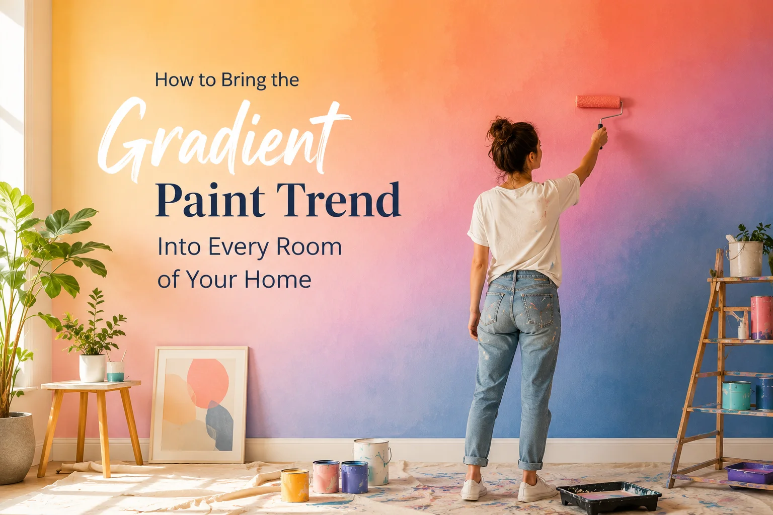
I used to think an accent wall only meant one thing, pick a bold color and paint one wall while the rest stay neutral. Then I came across a gradient painted balcony floor that faded from deep red into soft pink, no hard line anywhere, just one color quietly becoming another. I sat with that photo longer than I probably needed to. It did not look like a paint job. It looked like the wall was doing something.
That is the gradient paint trend in a sentence. Two or more colors blended into each other, with no visible seam, so the transition itself becomes the design. If this sounds familiar, you are right to think of ombre, the same effect people have used on hair and cakes for years. But the version showing up in homes right now is quieter and more controlled than the ombre walls that had their moment back in the mid 2010s. This is not a full wall soaked in rainbow color. It is subtle, tonal, and surprisingly easy to try on a budget.
Here is how to bring gradient paint wall ideas into your own home, room by room.
The earlier wave of ombre walls tended to lean dramatic, often stretching from a deep, saturated color at the bottom to white or a pale tint near the ceiling. It worked, but it read as a statement piece more than something that blended into everyday life.
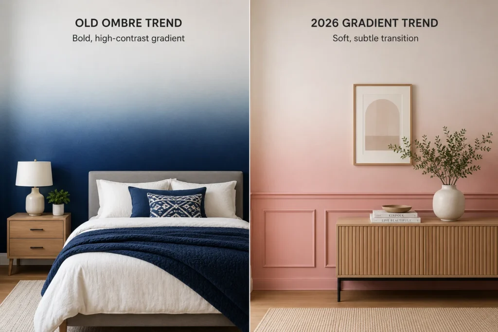
The 2026 version is softer. Instead of one dramatic wall, designers are using gradient techniques on smaller surfaces, a skirting board, a section of trim, an accent panel, or two closely related shades instead of two opposites. The effect feels more like a shadow or a shift in light than a painted stripe. That subtlety is exactly why it works in more rooms than the old ombre trend ever did.
Bedrooms are where this trend feels most natural, since the whole point of a bedroom is to feel calm rather than loud. A soft lavender fading into a pale blue behind the headboard creates a gentle, almost dreamlike backdrop without overwhelming a small room. Warmer combinations work just as well, a golden yellow blending upward into a bright white can make a bedroom feel sunlit even on a gray morning, while a rich burgundy easing into a soft pink brings warmth without tipping into anything overly bold.
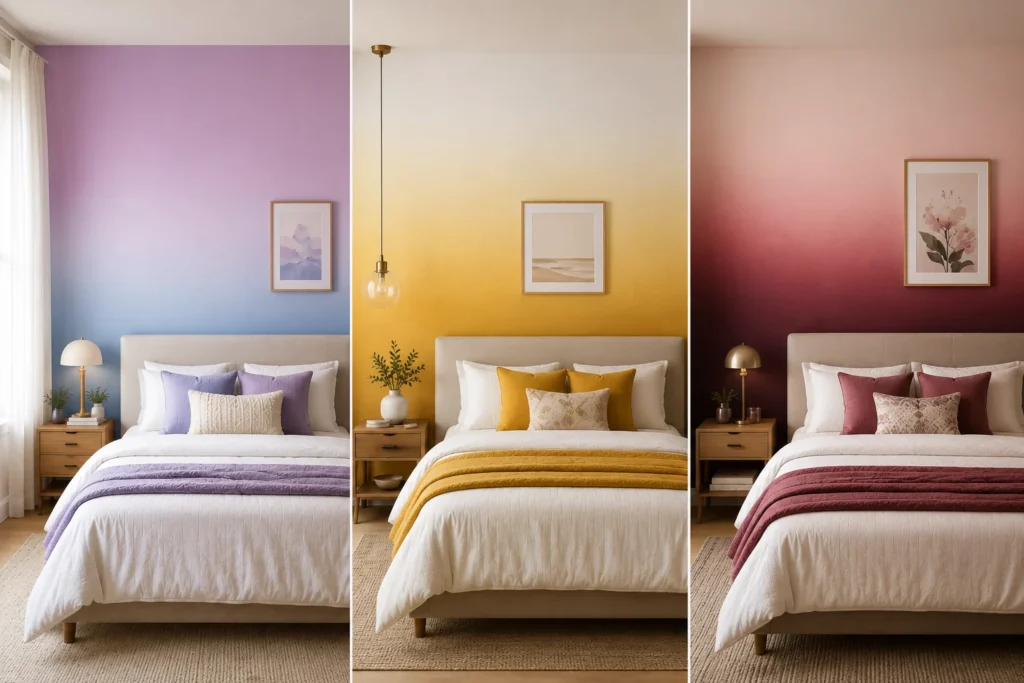
If your bedroom decor already leans minimalist, keep the gradient to two closely related tones rather than a dramatic pairing. The goal in a bedroom is a wall that feels like it is glowing slightly, not a wall that competes with the rest of the room for attention.
Dining rooms can handle a bit more boldness, since they are usually used in short bursts rather than lived in all day. A statement blue gradient across a dining wall, paired with simple furniture and a few table accessories, turns an ordinary dinner into something that feels a little more considered. Fuchsia fading into a softer rose is another combination that works particularly well in dining spaces, since the color reads as festive under warm lighting without feeling overwhelming during the day.
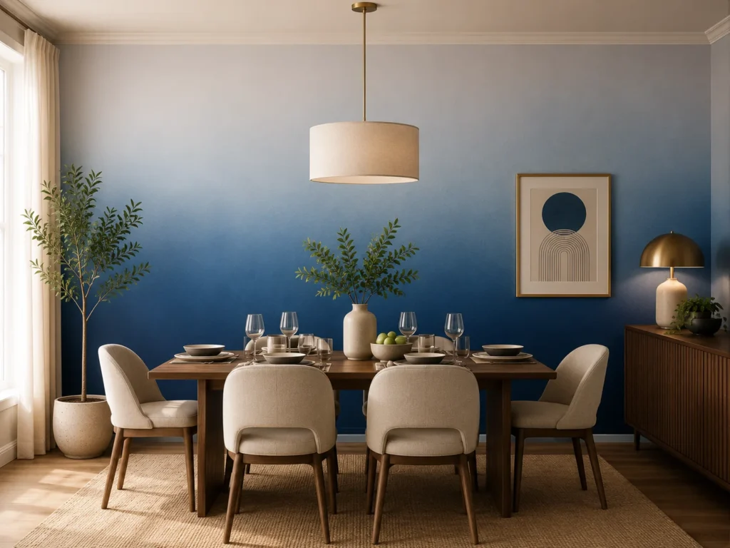
One detail worth keeping in mind for a dining room specifically, gradients that shift from a darker tone near the floor to a lighter one higher up tend to make the ceiling feel taller, which is a welcome trick in dining rooms that often feel boxed in by a table and chairs taking up most of the floor space.
Living rooms benefit from a slightly different approach, since this is the room most people spend the most waking hours in. A gradient that moves from a deeper shade at the floor up to a lighter tone near the ceiling can make a room feel taller and more open, a trick color theory experts have been recommending for a related trend called color capping, where just the ceiling gets a lighter or darker shade than the walls to visually stretch a room. Blending that same logic into a full gradient wall gives you a softer version of the same effect.
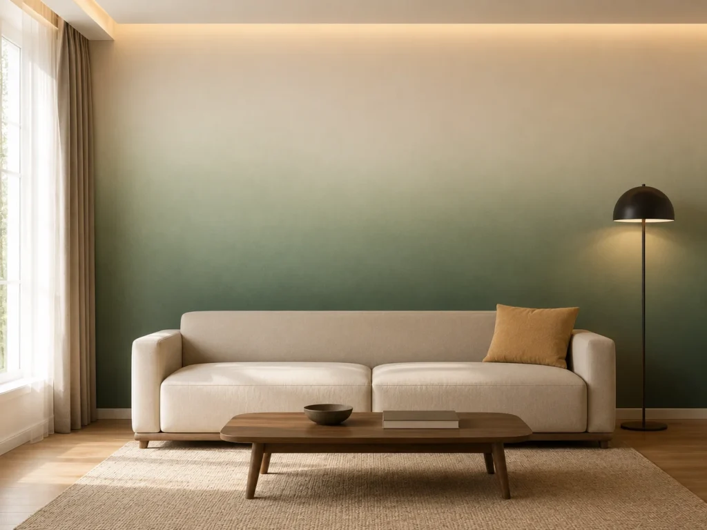
For anyone nervous about color, painting professionals suggest starting with colors that already sit close to each other, so the transition feels natural rather than jarring. Save more contrasting pairings for a smaller accent area, like a reading nook or a corner that could use a bit more personality.
You do not need professional equipment to try this, though a few tools make it noticeably easier.
What you will need
The basic technique
Start by dividing your wall into rough sections in your head, top, middle, and bottom. Apply your first color at one end and your second color at the other, leaving the middle section bare for now. While both colors are still wet, go back over the middle area with a dry brush and blend outward from each side, working in small sections rather than trying to blend the whole wall at once. Clean your brush frequently, since carrying too much of one color into the blend zone will make the transition look muddy instead of smooth.
If you are using a paint sprayer instead of a brush, the blending becomes noticeably easier and more even, since a sprayer avoids the visible brush strokes that can make a gradient look patchy up close. This is worth considering if you are attempting a larger wall rather than a smaller accent area.
Once you are happy with the blend, let everything dry fully before deciding whether it needs a second pass. Gradients are forgiving in that sense, since uneven spots can usually be fixed by going back over them with a bit more blending, unlike a solid color wall where a mistake often means starting over.
The biggest mistake is rushing the blend zone. A gradient lives or dies in that middle section, so working slowly there matters more than anywhere else on the wall. Skipping the practice run is another common misstep, since colors behave differently once they are on a vertical surface under real lighting compared to how they look in a paint swatch or on a horizontal test board.
It is also worth avoiding more than two or three colors for a first attempt. A gradient with too many transitions can start to look like a mistake rather than a design choice, especially in a smaller room where every wall is visible at once.
What makes this trend worth trying is how forgiving and low commitment it actually is compared to how dramatic it looks in photos. You are not repainting an entire room, you are reworking a single wall, a trim detail, or even just a skirting board, and the payoff is a space that feels noticeably more considered without a large budget behind it.
Start small if you are unsure. A single accent wall in a bedroom or a dining room gives you room to see how the technique feels in your own home before committing to anything larger.
The gradient paint trend blends two or more paint colors into each other on a wall or surface, with no visible line where the colors meet, creating a soft, tonal transition rather than a hard edged accent wall.
They use a similar blending technique, but the 2026 gradient trend tends to be more subtle, often applied to smaller sections like trim or a single wall, rather than the bold, full wall ombre effect that was popular in the past.
Colors that sit close to each other on the color wheel blend most naturally for a first attempt. Soft combinations like lavender into pale blue or golden yellow into white work well in bedrooms, while bolder pairings like blue or fuchsia suit dining rooms and accent areas.
No, a gradient can be blended by hand using brushes and a dry brush blending technique, though a paint sprayer makes the transition smoother and is worth considering for larger walls.
Bedrooms and dining rooms tend to be the easiest starting points, since bedrooms suit softer, calming gradients and dining rooms can handle bolder color pairings without feeling overwhelming.
Not every trending look is worth the upkeep. Here are the high-maintenance home decor trends that photograph beautifully but demand…

Lanterns get most of the attention when people talk about Mid-Autumn Festival, but the actual center of the holiday has…
Best small, budget-friendly Mid-Autumn Festival balcony decor ideas for moon viewing night, including the furniture, lighting, rugs, and paint colors…
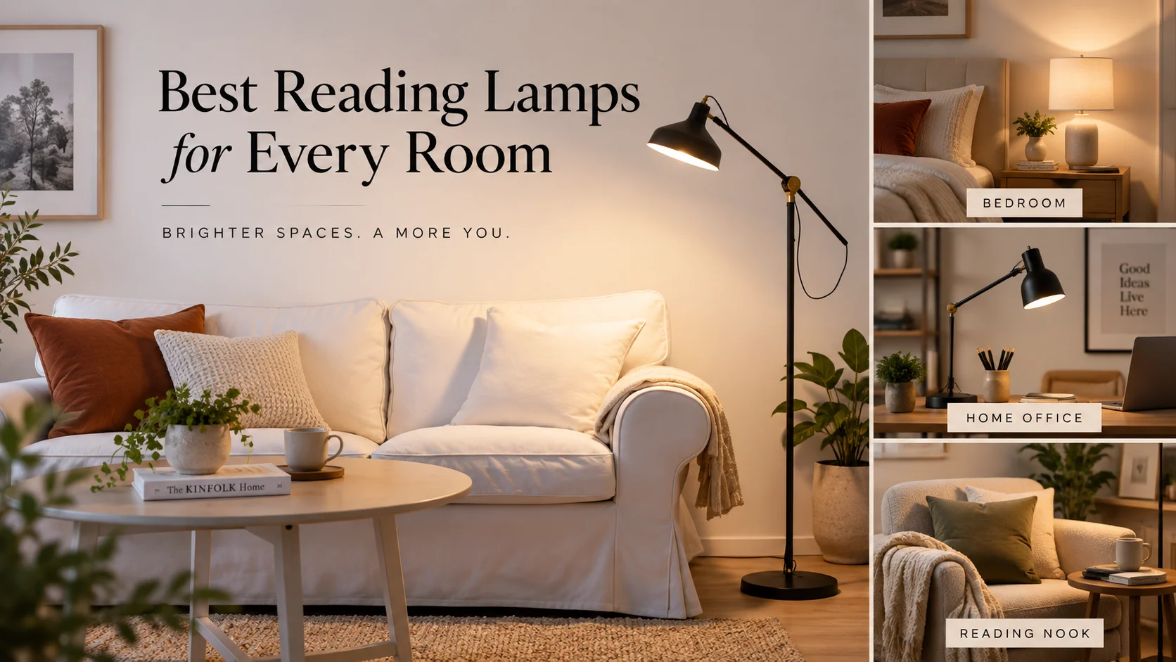
The best reading lamps are not one-size-fits-all. A bedside lamp has a different job than a living room reading lamp….
Some fall decor ideas earn their spot every year. Others just fill a landfill by November. Here are the fall…
Mid-Autumn Festival home decor ideas do not need to be complicated or expensive. From lanterns to a proper mooncake centerpiece,…