Address
304 North Cardinal
St. Dorchester Center, MA 02124
Work Hours
Monday to Friday: 7AM - 7PM
Weekend: 10AM - 5PM
Address
304 North Cardinal
St. Dorchester Center, MA 02124
Work Hours
Monday to Friday: 7AM - 7PM
Weekend: 10AM - 5PM

Picking a cabinet color and a wall color separately is where most kitchen color mistakes start. Here's how to choose kitchen cabinet and wall color combinations that actually work together, with real pairings for white, gray, green, navy, wood, and dark cabinets.
Most kitchen color mistakes do not happen because someone picked an ugly color. They happen because the cabinet color and the kitchen wall color were chosen separately, on two different days, without either one really being tested against the other. You fall in love with a kitchen cabinet shade at the paint counter, then pick a wall color a few weeks later that seemed nice on its own swatch, and only once it is all on the wall do the two colors start fighting.
This guide is built the other way round. Instead of listing kitchen colors on their own, it walks through kitchen cabinet color first, then the kitchen wall colors that actually sit well next to each one, so you are choosing a combination rather than two separate decisions.
Your cabinets take up more visual space than your walls in most kitchens, and they are far more expensive to change later, so they should be the anchor. Once your cabinet color is locked in, everything else, walls, backsplash, and even countertop, gets chosen to support it rather than compete with it.
If you already have your cabinet color, or your cabinets are staying as they are and you are only repainting the walls, this is genuinely good news. It narrows the decision down to one variable instead of two, which is exactly why working from the cabinet outward is the easier way to do this.
Two colors can look like they should go together and still clash the moment they are side by side, and undertone is almost always the reason. A wall color with a cool gray undertone next to cabinets with a warm cream undertone can end up looking slightly off, even though neither color is wrong on its own.
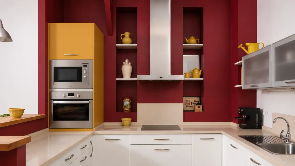
Before you commit, hold your cabinet sample and your wall sample together in the actual room, at different times of day, rather than trusting how they look separately on their own swatch cards. Warm colors pair most reliably with other warm colors, and cool colors pair most reliably with other cool colors. Mixing warm and cool deliberately can work, but it takes a more careful eye than most first attempts allow for.
Once undertone is sorted, the next decision is contrast, meaning how different your wall color is from your cabinet color in lightness or darkness. Interior color specialists sometimes measure this using a light reflectance value (LRV), which is essentially a number indicating how light or dark a color is. Kylie M Interiors has a genuinely useful breakdown of how to use LRV if you want to get technical about it, but you do not need to understand the number system to use the idea.
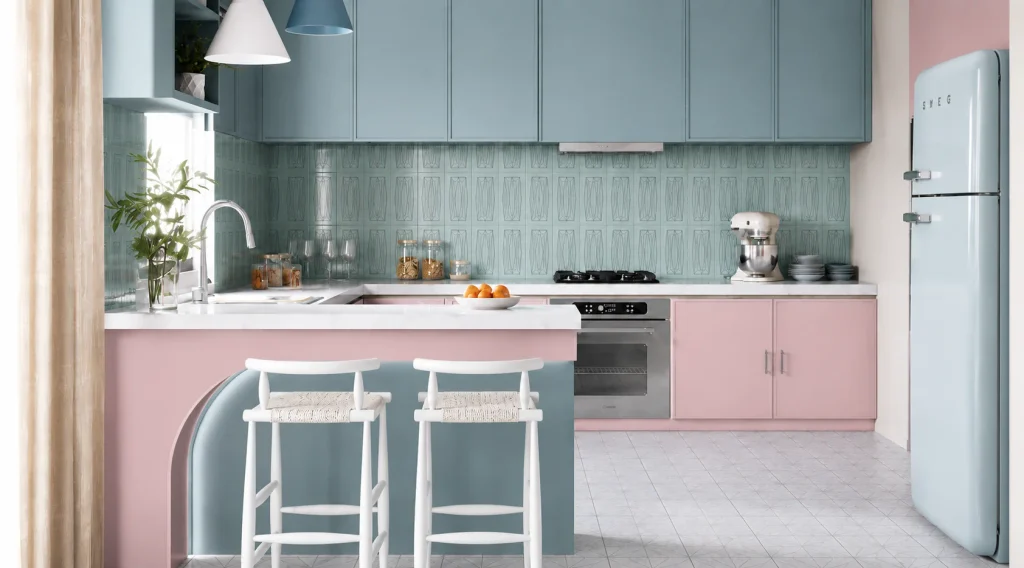
For a soft, low contrast look, keep your wall color close in lightness to your cabinet color. For a noticeable but still comfortable contrast, pick a wall color roughly one to two shades lighter or darker than your cabinets. For real drama, go for a wall color that sits at the opposite end of the light and dark scale from your cabinets entirely. None of these is more correct than the others. It comes down to whether you want your kitchen to feel calm and blended or bold and layered.
The single biggest reason a kitchen color combination looks perfect in the shop and wrong at home is light. A north facing kitchen with little direct sun will pull cooler and grayer than the same paint looks in a south facing kitchen with strong afternoon light. Darker, moodier combinations tend to hold up better in kitchens with plenty of natural light, while low light kitchens generally read better with lighter cabinet and wall pairings that do not swallow what little light is there.
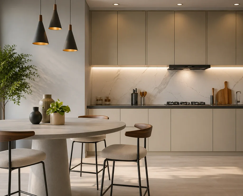
Always test your actual chosen colors on your actual wall, not just on a paint chip held up under shop lighting. Look at the sample in the morning, in the afternoon, and again once it is dark and your kitchen lights are on, since a combination that reads beautifully at noon can look completely different under evening lighting.
Kitchen cabinets and walls are not actually the only two colors in the room, and ignoring the backsplash and countertop is a common way a combination that looked fine in your head ends up feeling disjointed once it is finished. Your backsplash sits on the same eye line as your kitchen cabinets and tends to matter more than most people expect, since it bridges the cabinet color and the wall color visually.
Your countertop matters slightly less because it is horizontal rather than vertical, but a countertop with strong veining or a warm stone tone can still pull a combination in a direction you did not plan for. Before finalizing either your cabinet or kitchen wall color, hold your samples up against your actual countertop and backsplash material, not just against each other.
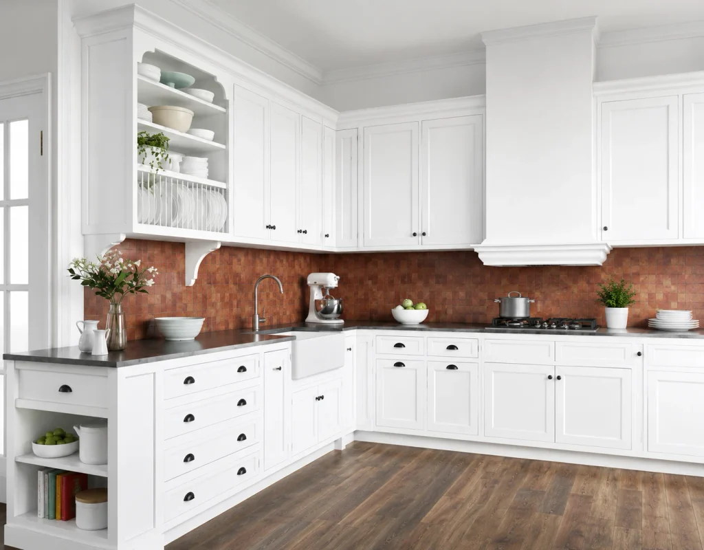
White kitchen cabinets are the most forgiving starting point, which is part of why they stay so popular. Warm gray or greige walls give a soft, grounded contrast that keeps a white kitchen from feeling clinical. A pale, warm beige works well if you want something even softer. For more contrast, a deeper taupe or a muted sage green wall against crisp white cabinets gives the room a bit more personality without overwhelming it.

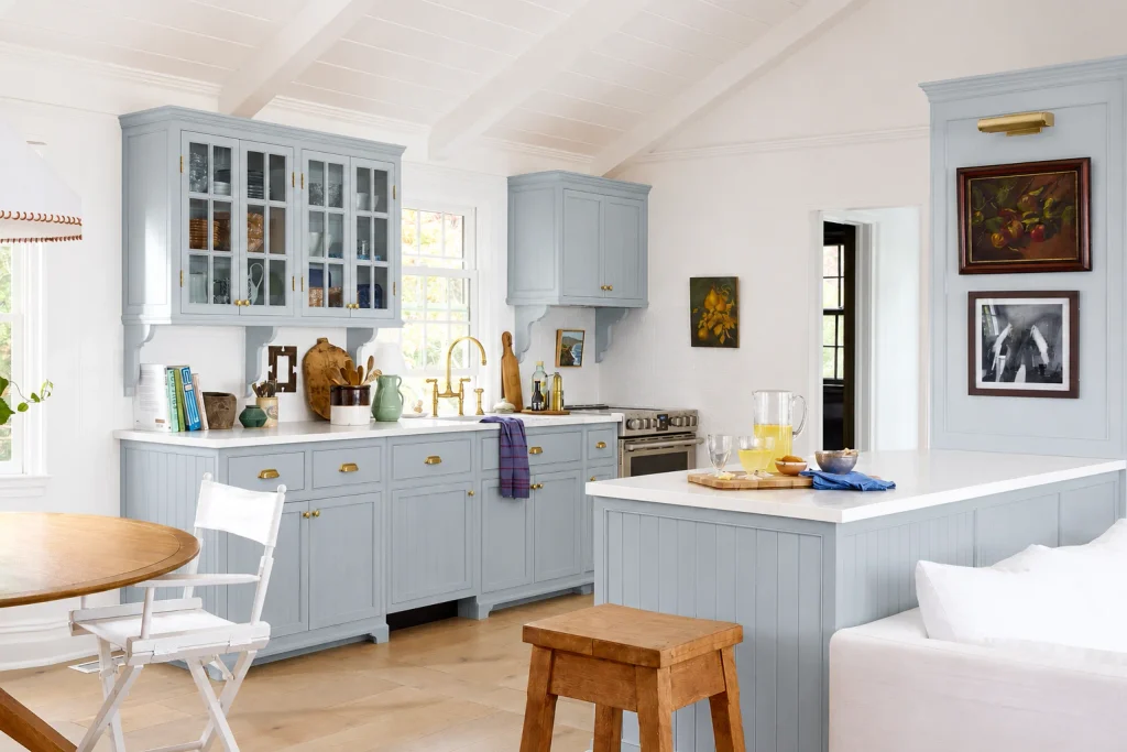
Gray cabinets pair naturally with warm white or soft cream walls, since the warmth in the kitchen wall color balances out any coolness in the gray. A pale beige wall also works well here, particularly in kitchens with wood flooring, since it bridges the cool cabinet tone and the warm floor tone rather than sitting awkwardly between them.
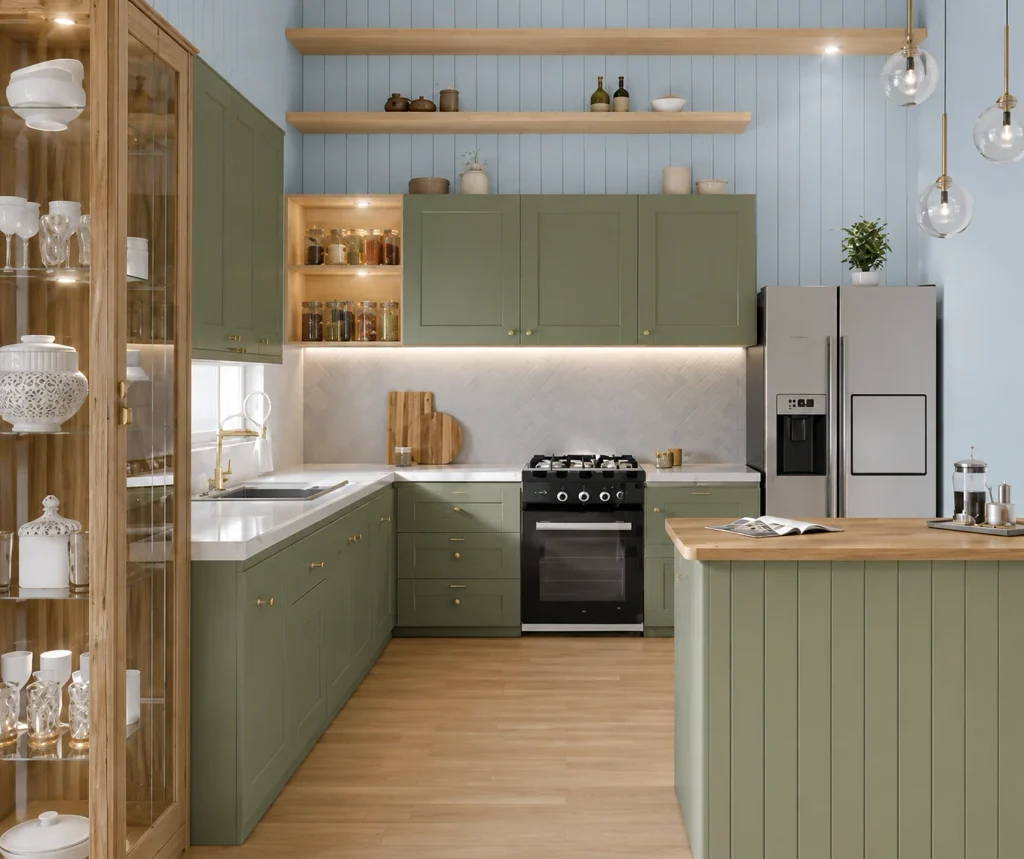
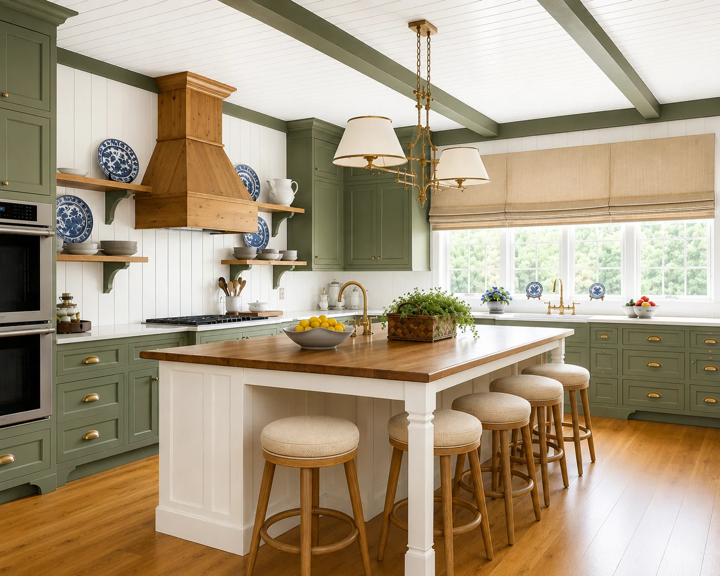
Green kitchen cabinets, sage in particular, have become one of the strongest kitchen trends of the past couple of years, and cream or warm white walls remain the most reliable pairing. The cream keeps the green from feeling too heavy, and it is a combination that shows up again and again in current kitchen coverage, including many kitchen paint color ideas, which features several sage and olive cabinet kitchens paired with soft white walls and trim.
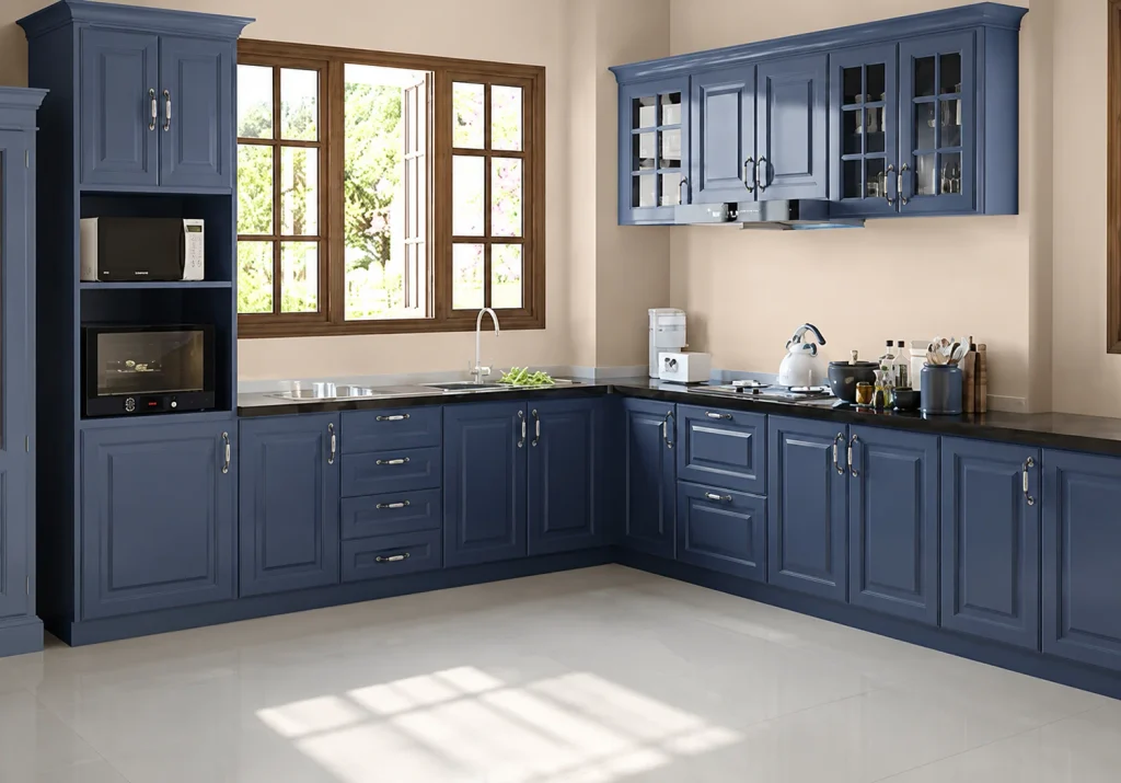
Navy kitchen cabinets against crisp white walls is one of the most dependable high contrast combinations in kitchen design, and it tends to photograph as well as it looks in person, since the deep blue reads as sophisticated rather than heavy. For a slightly softer version of the same idea, a warm off white or a pale gray wall gives navy cabinets a bit more breathing room than stark white does.
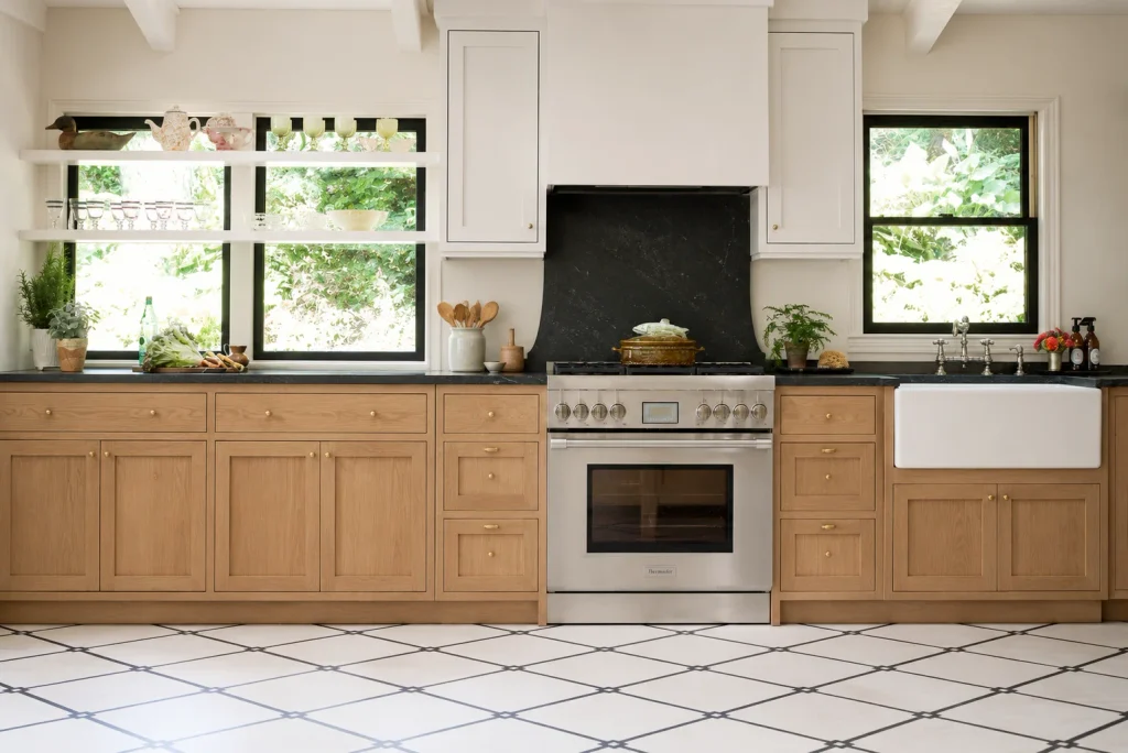
Natural or stained wood kitchen cabinets pair most easily with warm white or soft beige walls, since the goal is usually to let the wood grain be the visual interest rather than competing with a strong wall color. If your kitchen leans more country or farmhouse in style, a muted sage green wall works particularly well against lighter oak tones, echoing the same pairing that works so well with painted green cabinets.
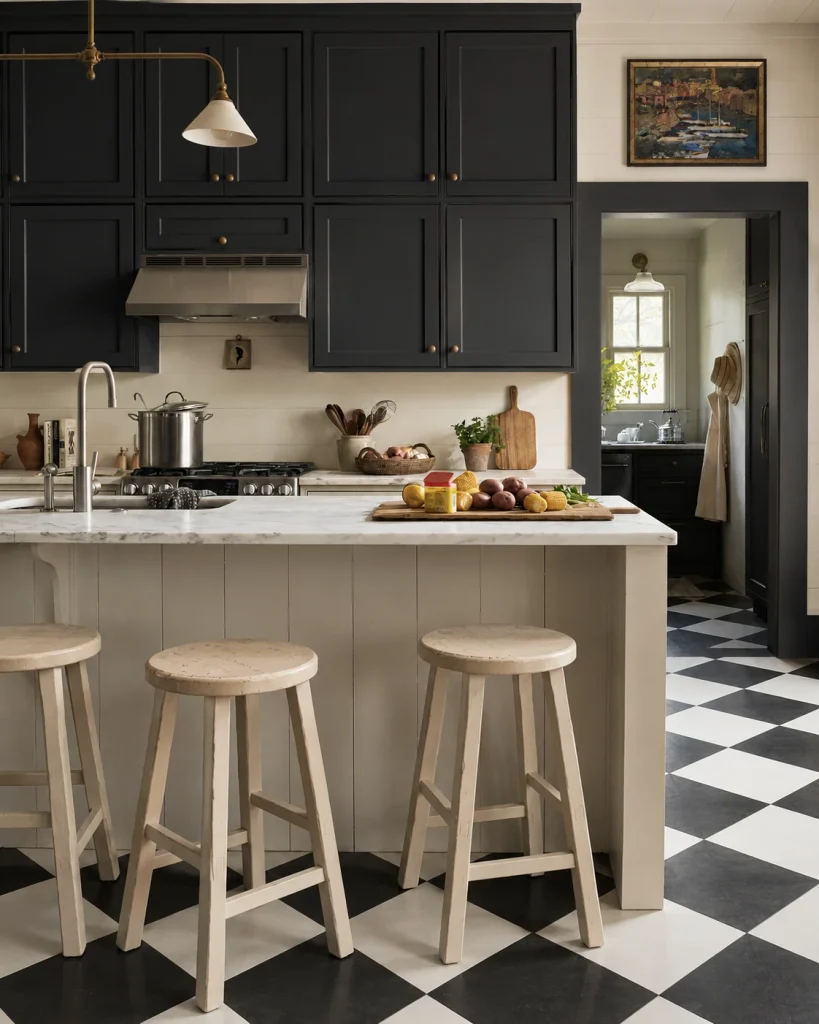
Dark cabinets need light walls to keep the room from feeling closed in, especially in a smaller kitchen. Bright white or a soft off white wall is the most dependable choice, and it is worth leaning on strong lighting alongside it, since dark cabinets absorb more light than pale ones do. If you have good natural light and want more depth, a warm greige wall can work, but it is worth testing carefully, since two dark or muted tones together can tip a kitchen from moody into dim.
Two tone cabinetry, where the upper and lower cabinets are different colors, has become a strong trend in its own right, and it changes how you should think about the wall color. Rather than pairing your wall against one cabinet color, you are pairing it against two at once, so a neutral wall color, a warm white, cream, or soft greige, is usually the safer choice.
It gives both cabinet colors room to stand out instead of the wall competing with either one. A common and reliable version of this look pairs a white perimeter with a wood or deep green island, with the walls kept in a soft neutral that lets both cabinet tones read clearly.
In a small kitchen, lighter cabinet and wall combinations generally make the space feel more open, since pale tones reflect more light and do not visually shrink the walls the way darker colors can. That does not mean a small kitchen cannot handle a bold cabinet color. It just means the wall color usually needs to stay light to balance it out, rather than adding a second strong color on top of a strong cabinet choice.
A few mistakes come up again and again. Choosing the wall color before the cabinet color, rather than the other way round, is one of the most common, since it makes the cabinet decision feel more restricted than it needs to be. Matching two different neutrals too closely, such as a warm beige cabinet against a cool gray wall, is another, since near misses in undertone are often more jarring than an obvious contrast would have been.
And skipping the in room test entirely, relying only on how colors look on a small paint chip or on a screen, is the mistake that causes the most repainting. For more of the best kitchen decor ideas, keep visiting the decor dash.
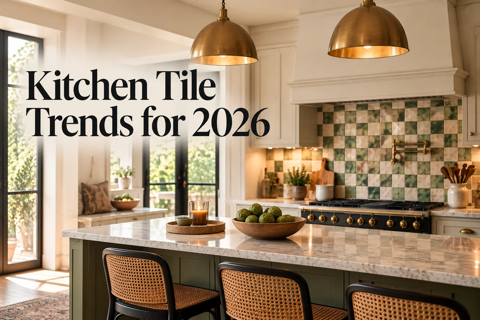
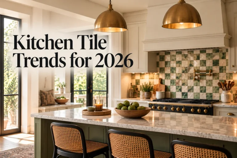
Looking for a kitchen update that makes a difference? Discover kitchen tile trends 2026, with ideas for stylish backsplashes, statement…

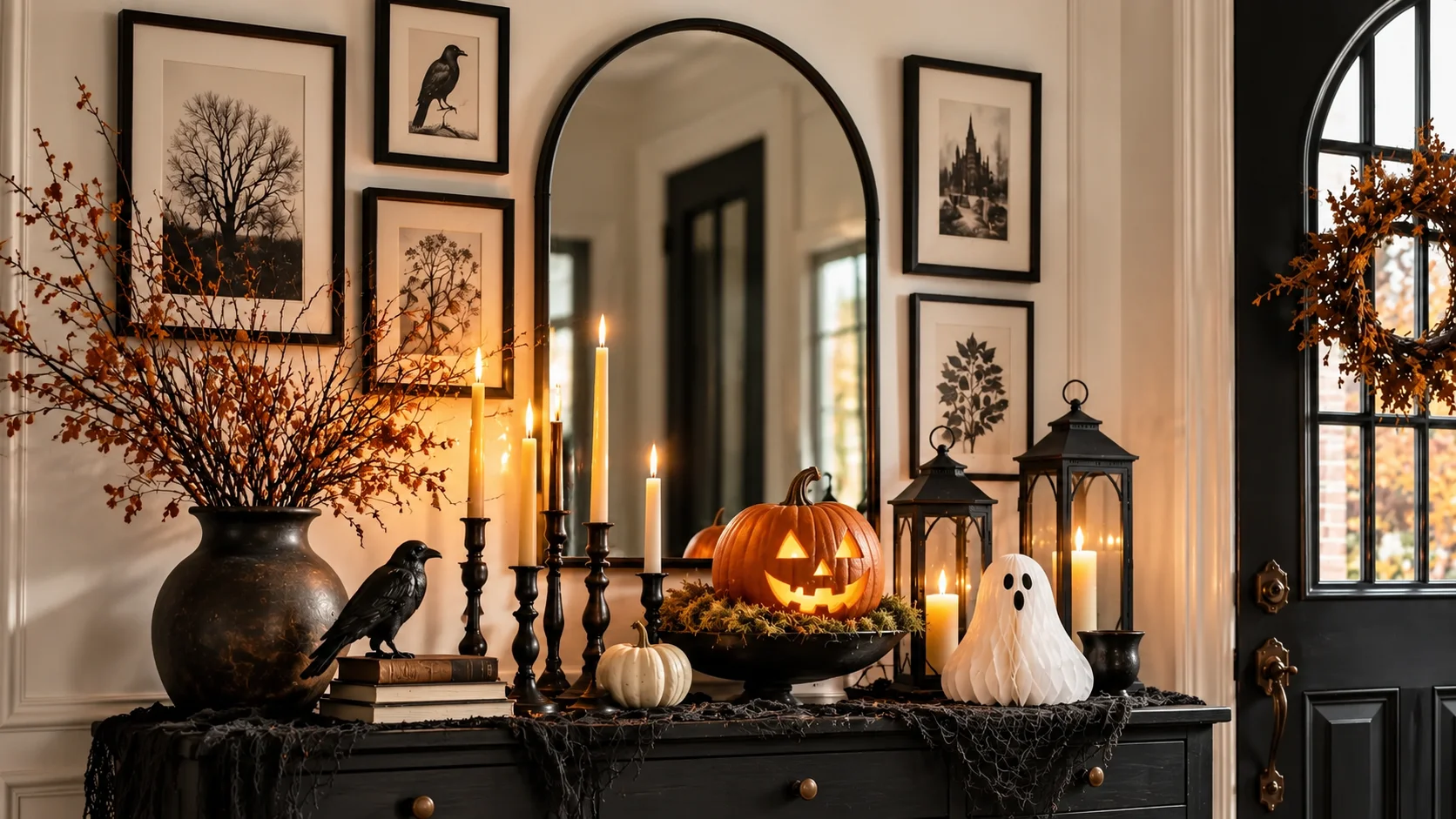
The best Halloween decoration ideas don’t need plastic skeletons or a big budget. Here’s how to build a spooky, stylish…
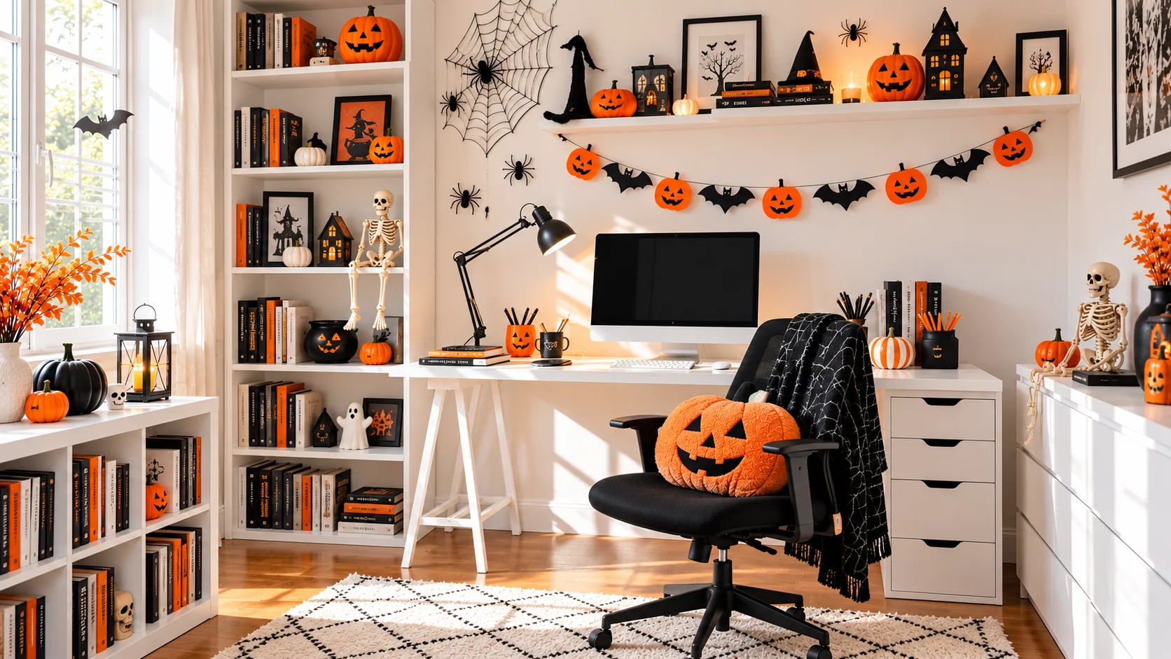
Most Halloween decor guides forget the one room you’re actually sitting in every day. Here are Halloween home office decor…
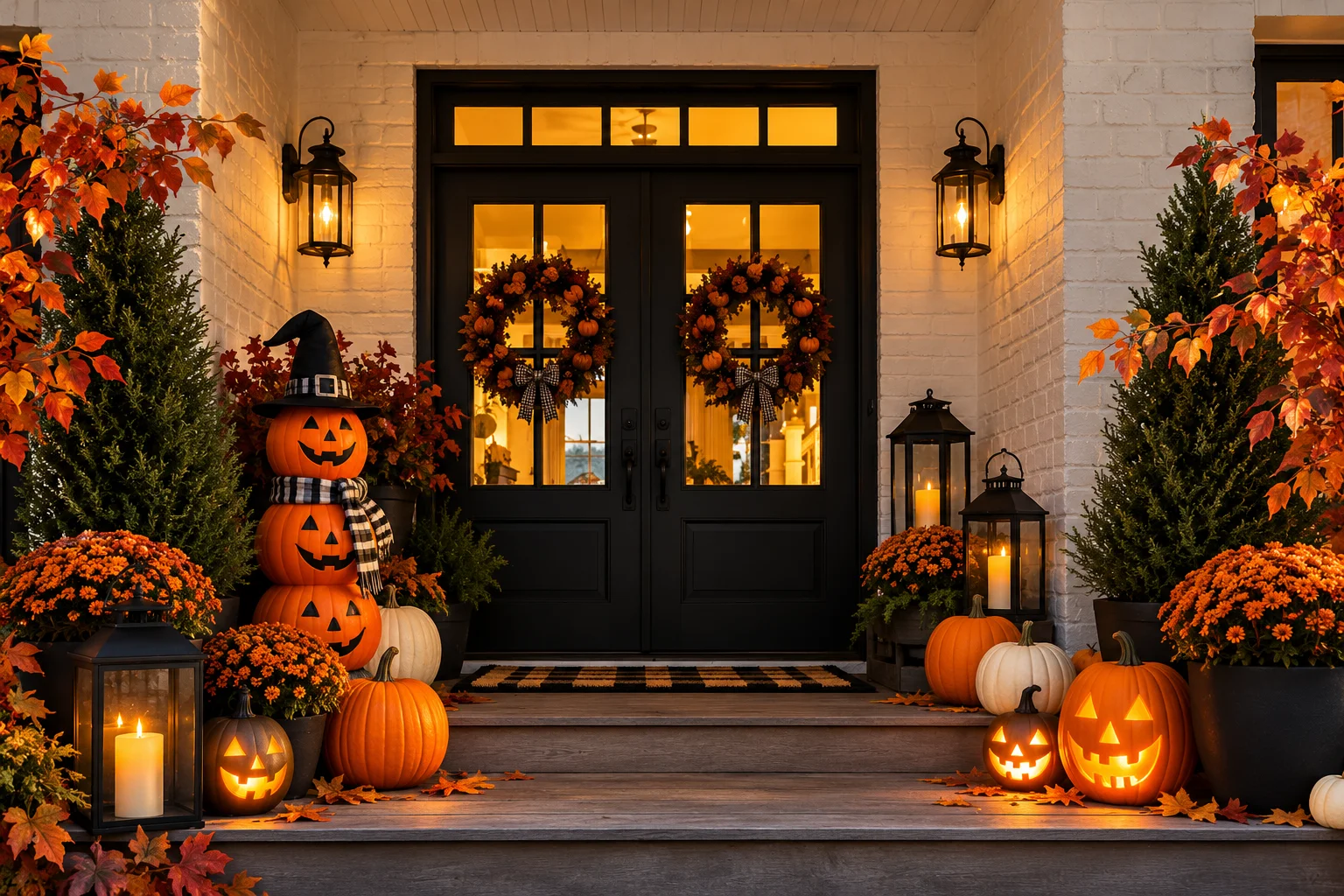
Halloween porch decor sets the mood before anyone knocks. Here are easy, spooky ideas to make your porch the one…
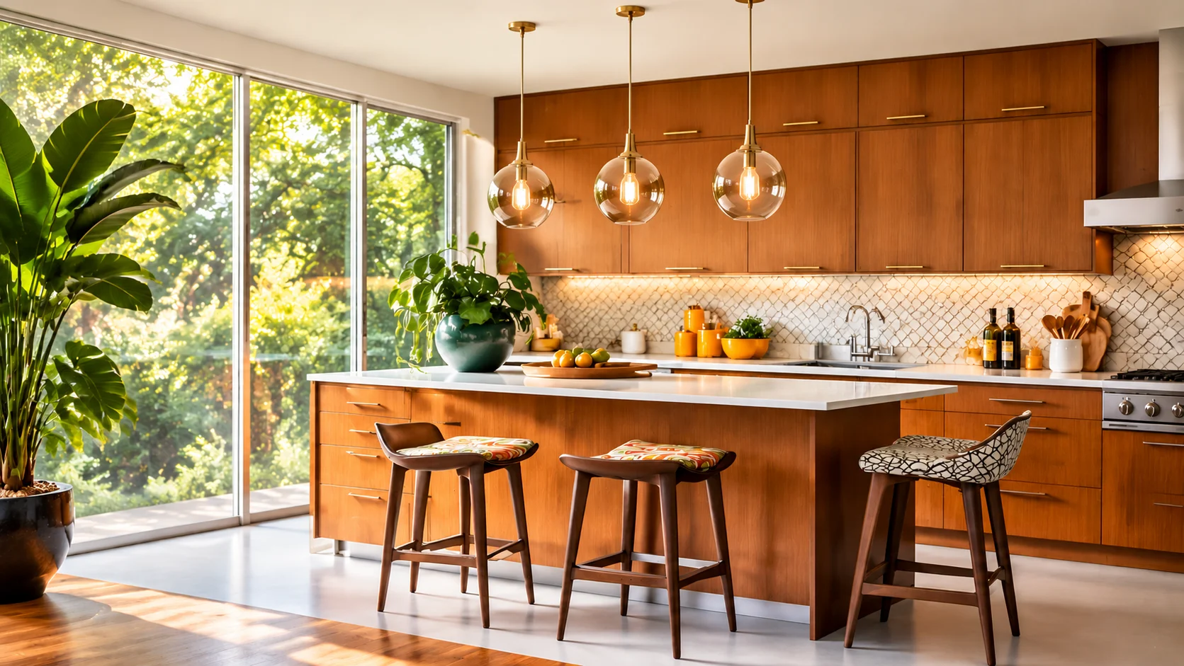
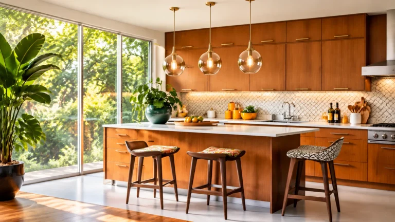
Midcentury modern kitchen style never really went away. Here are simple midcentury modern kitchen ideas for color, wood, tile and…
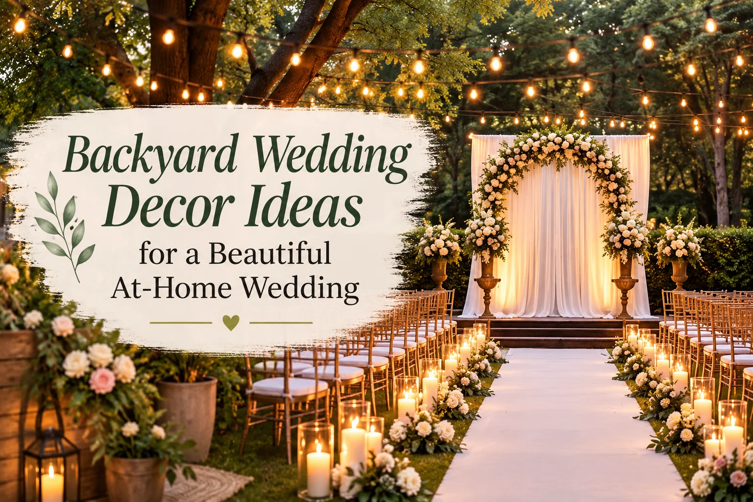
Backyard wedding decor is quietly outshining venue weddings in 2026 — more intimate, more personal, and a fraction of the…
There is no single best wall color, since it depends on your cabinet color, but warm whites, soft grays, and warm greiges are the most dependable starting points for the widest range of cabinet colors.
Not usually. Most kitchens look better with some contrast between cabinets and walls, though a very close, low contrast pairing can work well if that is the calmer look you want.
Warm gray, greige, and soft taupe are the most reliable choices, since they add warmth and depth without competing with the white.
Warm white or soft cream walls balance out the coolness in gray cabinetry and tend to be the safest, longest lasting pairing.
Cream or warm white is the most common and most dependable pairing, since it softens the green rather than intensifying it.
Lighter walls are the more common and generally safer choice, particularly with darker or bolder cabinet colors, since they help balance the room and keep it from feeling heavy.
Light, warm neutrals on both the cabinets and walls reflect the most light and tend to make a small kitchen feel more open than darker combinations.