Address
304 North Cardinal
St. Dorchester Center, MA 02124
Work Hours
Monday to Friday: 7AM - 7PM
Weekend: 10AM - 5PM
Address
304 North Cardinal
St. Dorchester Center, MA 02124
Work Hours
Monday to Friday: 7AM - 7PM
Weekend: 10AM - 5PM

Looking for a kitchen update that makes a difference? Discover kitchen tile trends 2026, with ideas for stylish backsplashes, statement floors, textured finishes and colors that work with real homes.
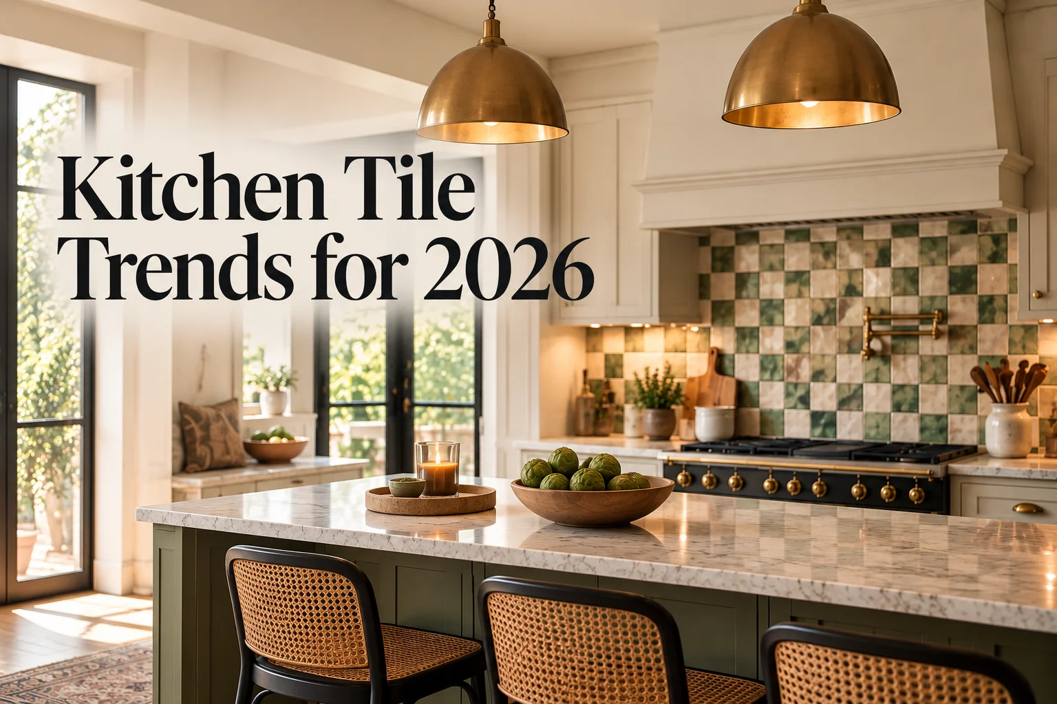
Tiles can change the entire look of a kitchen without requiring you to replace every cabinet or invest in a complete renovation. The right choice can make a plain wall feel more considered, give a kitchen island a distinctive finish, or bring some personality to a room that currently feels a little flat.
As an interior designer, I would never choose kitchen tiles based on appearance alone. You also need to think about how you cook, how much cleaning you want to do, the natural light in your kitchen and the finishes you already have. A beautiful tile that clashes with your worktop or needs constant attention may not be the best choice for your home.
The kitchen tile trends 2026 worth considering are not all about dramatic colors or complicated patterns. Some focus on handmade finishes and subtle texture, while others bring back familiar designs in more interesting ways. There are also practical options for homeowners who prefer a clean, modern look.
Here are eight ideas to help you decide which tiles could work in your kitchen, whether you are planning a full renovation or simply want to refresh the backsplash.
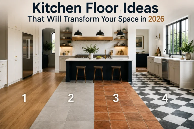
Checkerboard flooring has been around for a long time, but it does not have to look traditional or overly formal. The secret is to rethink the colors, tile size and layout.
Black and white remains a classic combination, especially in kitchens with white cabinets, dark worktops or simple wooden furniture. If that contrast feels too strong, try softer shades instead. Cream and muted green, pale grey and off-white, or terracotta and sand can create a similar pattern without dominating the room.
The layout makes a difference, too. Standard square tiles give you a familiar checkerboard effect, while turning square tiles diagonally creates a diamond pattern. It is a small change, but it can make the floor feel more distinctive.
How I would use it: In a kitchen with plain cabinets and a simple backsplash, I might introduce checkerboard tiles on the floor to provide the main decorative feature. If the cabinets already have a strong color or detailed fronts, I would choose a quieter two-tone combination.
Think about scale before buying. Large checks can look striking in an open kitchen, while smaller patterns may suit a compact room. Ask to see a sample layout if possible, because the effect of a repeating pattern can look very different across an entire floor.
For everyday use, choose floor tiles with a suitable slip rating and a finish designed for the amount of traffic your kitchen receives. A decorative floor should still feel safe and easy to maintain.
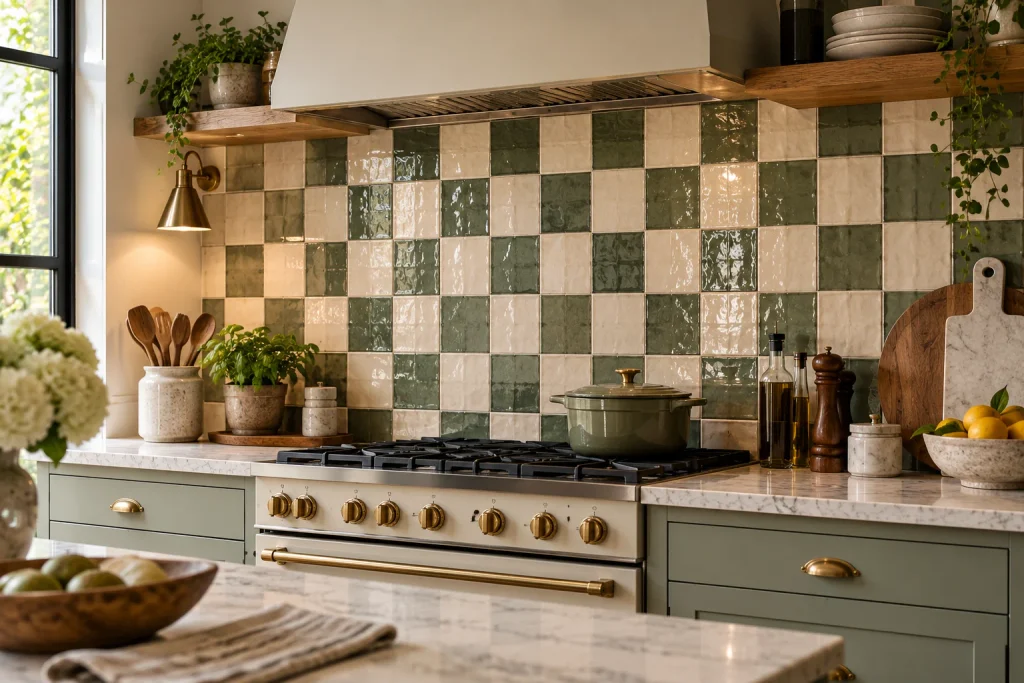
Handmade-look tiles are a good choice if you want your kitchen to feel individual rather than overly uniform. Their appeal often comes from small variations in color, surface and shape. The finish may be slightly uneven, and the glaze can catch the light differently from one tile to the next.
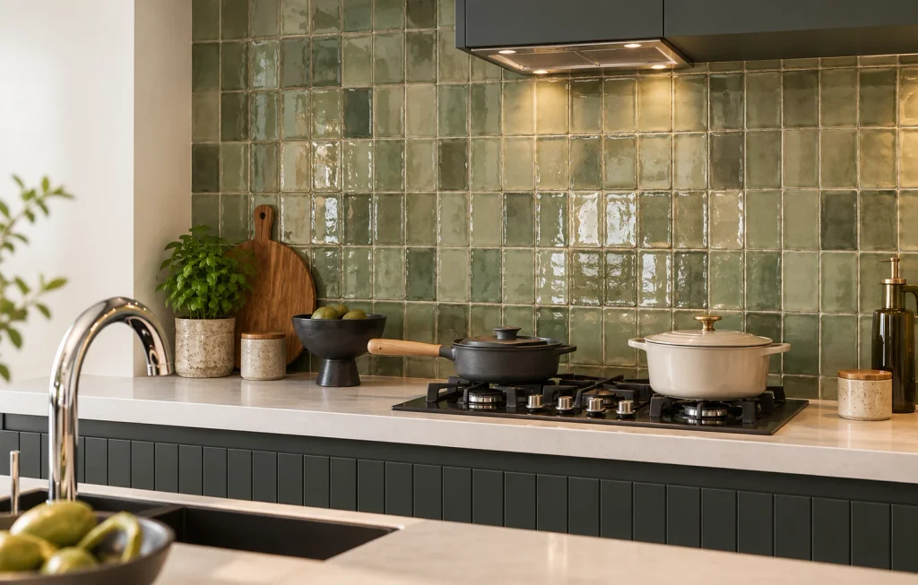
Zellige-style tiles are one example. Inspired by traditional Moroccan tilework, they are often recognized by their glossy surfaces, irregular edges and subtle shifts in tone. You can find them in whites, greens, blues, earthy browns and many other shades.
These tiles work particularly well as a backsplash because they add interest without needing an elaborate pattern. A row of glossy green tiles behind a cooker, for example, can bring depth to a kitchen with cream cabinetry and a pale stone worktop. Soft white tiles can also add character to a neutral kitchen without making it feel busy.
How I would use it: I would look at handmade-look tiles when a kitchen feels too flat, especially if the cabinets and counters have smooth, plain finishes. The tile surface provides another layer of detail, so you may not need much extra decoration.
There is one practical point to remember. Genuine handmade tiles can vary considerably, and some products need more careful installation or sealing than others. If you love the appearance but want easier maintenance, compare ceramic and porcelain alternatives with a similar finish.
Check the manufacturer’s care instructions before choosing a tile for a backsplash near the hob or sink. A textured or irregular surface can be beautiful, but grease and food splashes still need to be cleaned easily.
Large-format tiles are worth considering if you prefer a clean, uncluttered kitchen. Because they cover a larger area, they create fewer grout lines than smaller tiles. This can make walls and floors appear more continuous, allowing the cabinets, worktop and other materials to stand out.
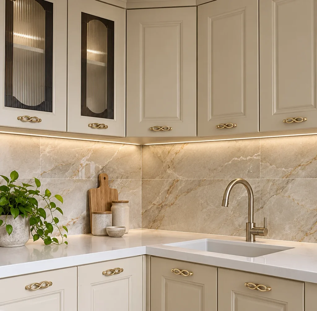
Stone-look porcelain is particularly useful for this style. It can recreate the appearance of limestone, marble or travertine without requiring you to use natural stone throughout the room. Depending on the product, you can choose subtle veining, cloudy tonal variations or a more uniform surface.
For a modern kitchen, large pale tiles can complement flat-front cabinets, simple handles and a restrained color scheme. If you prefer a stronger look, darker stone-effect tiles can create contrast against lighter cabinetry.
How I would use it: In a smaller kitchen, I would consider large-format tiles in a light, relatively consistent color. Fewer grout lines can help the space feel less visually broken up, although the final result also depends on the room’s proportions, lighting and layout.
Do not assume that the biggest tile is always the best tile for a small room. Large pieces may require more cutting around corners, cupboards and narrow sections. They also need a properly prepared, level surface and an installer who knows how to handle their size and weight.
Grout still matters. Choose a shade that works with the tile rather than selecting it as an afterthought. A close match can create a quieter finish, while a contrasting grout makes the layout more noticeable.
A colorful backsplash can change the atmosphere of a kitchen without forcing you to commit to brightly colored cabinets. Deep green, burgundy, muted blue, terracotta and dusty pink are all worth exploring if you want something more distinctive than plain white.
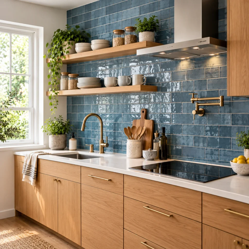
The trick is to give the color a clear role in the room. If you have neutral cabinets and a simple worktop, a strong tile color can become the main feature. If your kitchen already has several competing finishes, a more muted shade may be easier to live with.
Dark green tiles, for instance, can look striking with natural wood, cream cabinets or brushed brass details. Terracotta can complement warm timber and pale stone. Burgundy is a more dramatic option that can bring depth to a kitchen with otherwise understated finishes.
How I would use it: I would start with one main color and build the rest of the scheme around it. You do not need to match every accessory to the tiles. In fact, keeping the worktop, cabinets and larger surfaces relatively simple usually makes the color feel more intentional.
Light also affects how a tile looks. A glossy tile may appear brighter near a window and darker in a shaded corner. Matte finishes tend to reflect less light, while strong glaze variations can make a color look different from one tile to another.
Before committing, place a sample against your cabinet door and worktop. Look at it in daylight and under your kitchen lights. This simple step can prevent an expensive mismatch.
Patterned tiles are ideal when you want your kitchen to have a little more personality. Designs range from traditional geometric motifs to floral patterns, decorative borders and tiles inspired by Mediterranean or Moroccan interiors.
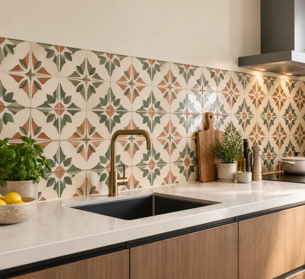
You do not need to cover every wall in pattern to get the effect. A smaller section behind the cooker, a defined backsplash area or a decorative strip can be enough to make the room feel thoughtfully designed.
For a kitchen with plain shaker cabinets, patterned tiles can add detail without requiring decorative cabinet doors. In a contemporary kitchen, a restrained geometric design can create a useful contrast with clean lines and smooth surfaces.
How I would use it: I would choose patterned tiles when the room needs a focal point. For example, a muted blue-and-cream pattern can sit comfortably with white cabinetry and a timber worktop, while a terracotta motif can work well with beige or olive-green cabinets.
Keep the rest of the finishes under control. If the tiles have several colors, choose one or two of those shades for other details in the room. You could repeat a color in the cabinet paint, bar stools or a small accessory, but there is no need to match everything.
The scale of the pattern matters. Large motifs may be easier to appreciate across a broad backsplash, while smaller designs can suit a compact area. Ask your installer how the pattern will line up around sockets, corners and cupboards. A lovely design can lose its impact if it is cut awkwardly in several places.
A kitchen rarely relies on one material alone. Cabinets, worktops, flooring, metal finishes and tiles all contribute to the final look. Bringing these materials together thoughtfully can make the room feel more layered and less like everything came from one matching set.
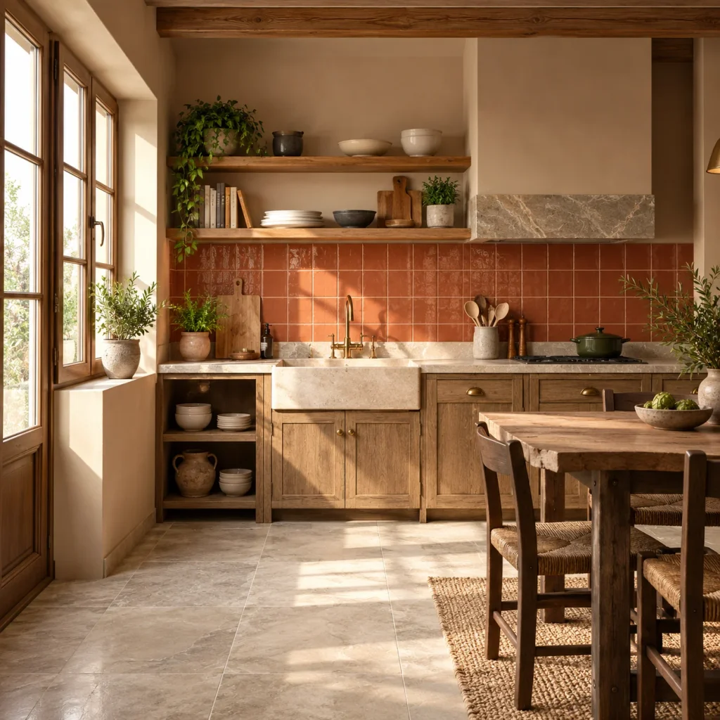
One approach is to combine a simple tile with a more expressive worktop. Another is to pair a textured backsplash with smooth cabinet fronts. You could also use stone-look tiles alongside wood, creating a contrast between the cooler surface and the natural grain of the timber.
The aim is not to introduce as many finishes as possible. It is to give each material enough space to be appreciated.
How I would use it: If you already have a marble-effect worktop with noticeable veining, I would usually choose a quieter backsplash. If the worktop is plain, the tiles can take on a stronger role through color, texture or pattern.
A tiled kitchen island is another option for a more distinctive design. Cladding the sides of an island in small-format tiles can turn it into a feature, especially when the rest of the cabinetry is simple. This works best when the tile color relates to another finish in the kitchen rather than appearing completely unrelated.
There are practical details to consider with an island. The surface must be suitable for the area, and the edges need careful finishing to protect against chips and knocks. The worktop should remain practical for food preparation, so decorative tiles are generally better suited to the island’s vertical sides than its main working surface.
Before mixing finishes, collect samples and look at them together. A tile that looks perfect in a showroom may appear too yellow, too cool or too shiny beside your existing materials.
The shape and placement of a tile can change its appearance almost as much as its color. Instead of laying every rectangular tile horizontally, consider a vertical stack, a narrow upright format or a more structured arrangement.
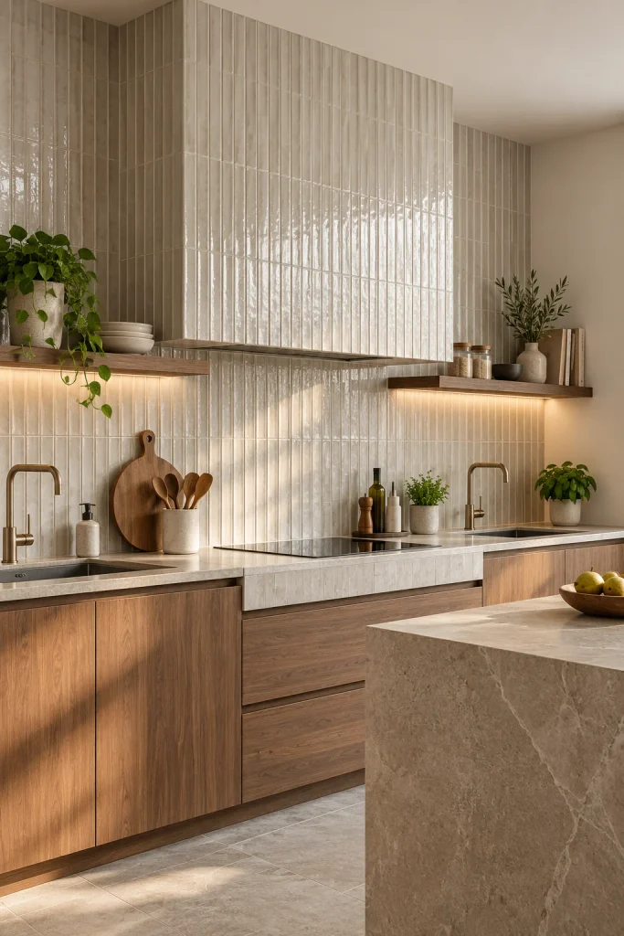
Vertical layouts draw the eye upwards and can make a backsplash feel taller. They work especially well behind a sink or cooker, or in a kitchen with open shelving. A simple rectangular tile can look quite contemporary when installed vertically with neat, consistent grout lines.
Textured tiles offer another way to add interest. Fluted, ribbed or gently sculpted surfaces create shadows that shift as the light changes. They can make a plain wall more engaging without relying on a bright color or busy print.
How I would use it: In a kitchen with straightforward cabinets, I might choose narrow vertical tiles to introduce a little movement. If the room already has strong lines from shelves, handles and cabinet panels, I would be more selective and use texture on one defined section.
Glossy tiles can reflect light, which may help brighten a darker backsplash. Matte finishes create a quieter effect and can complement natural materials. Neither is automatically better; it depends on the result you want and how much cleaning the surface will require.
Do check the cleaning requirements for deeply textured tiles before using them near the cooker. Grease can collect in pronounced grooves, and some finishes need more effort to keep looking their best. A subtle ribbed surface may give you the look you want without adding too much maintenance.
Terrazzo is known for its speckled appearance, created by fragments of stone or other materials set into a base. You can use actual terrazzo or choose porcelain tiles designed to recreate the look. Both can bring a lively, graphic quality to a kitchen, although their care requirements and performance will vary by product.
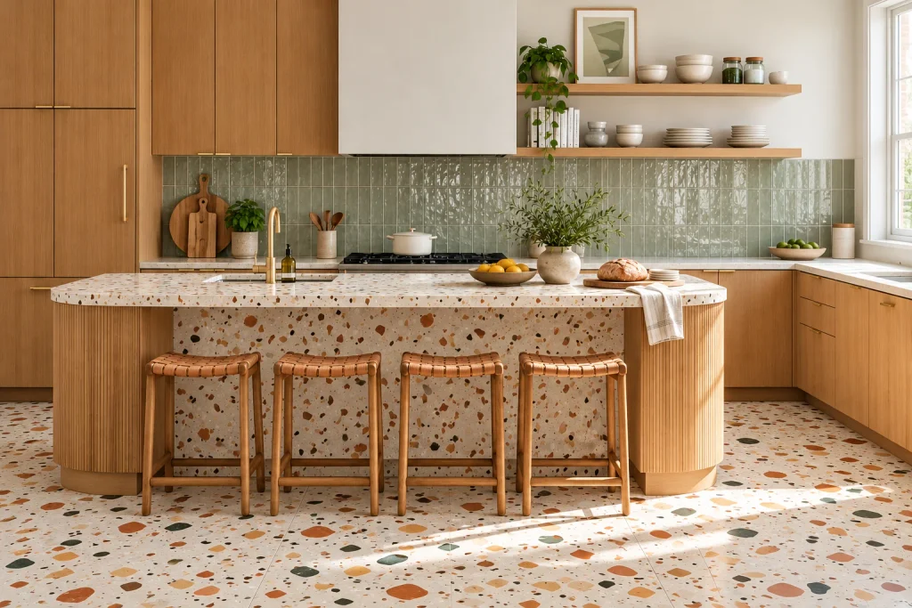
The pattern can be bold or subtle. Large, colorful fragments create a more playful look, while smaller flecks in neutral shades can sit comfortably with understated cabinetry. Terrazzo-style tiles are also a way to introduce several colors without adding a separate patterned backsplash.
Statement flooring is not limited to terrazzo. A two-tone checkerboard, decorative border or tile rug effect can help define the kitchen floor, particularly in a larger room or an open-plan space.
How I would use it: I would let the floor lead the design when the rest of the kitchen is fairly simple. Neutral cabinets, a plain worktop and restrained accessories give a decorative floor room to stand out. If your backsplash already has a bold pattern, a quieter floor is usually the easier combination to live with.
Think about the floor from the start rather than treating it as the final finishing touch. It affects how the cabinets, island and worktops look together. The tile format, grout color and pattern alignment should be planned before installation.
For a busy family kitchen, prioritize durability, slip resistance and ease of cleaning. Ask whether the specific product is suitable for kitchen floors, and follow the manufacturer’s guidance on installation and maintenance. A beautiful finish is only successful if it can handle everyday use.
Trends can help you discover new ideas, but your kitchen should suit your routine and your home. Before making a final decision, consider these practical points:
The kitchen tile trends 2026 that will work best for you are the ones that suit your space and make daily life easier. A handmade backsplash may be the right choice for someone who loves surface texture, while another homeowner may prefer the clean lines of large-format porcelain or a patterned floor.
You also do not need to follow every new idea. If you love a classic white tile, you can make it feel current through the layout, grout color or the materials around it. Good design is not about replacing everything whenever tastes change. It is about making choices that feel right for your home.
Tiles can be one of the most effective ways to give your kitchen a new look. They can introduce color, create a focal point, add texture or bring the different finishes in the room together.
If you are unsure where to begin, start with one area. Refresh the backsplash, choose a more interesting floor or use textured tiles behind open shelving. Compare samples before committing, and make sure the product is suitable for the job.
The strongest kitchen designs balance appearance with everyday practicality. Choose tiles you enjoy looking at, but also ones that suit the way you use your kitchen. That is what makes a design feel right long after the latest trend has passed.
Popular design directions include handmade-look tiles, checkerboard patterns, large-format stone-effect surfaces, rich colors, decorative motifs, textured finishes and terrazzo-style flooring. The best choice depends on your kitchen’s size, light and existing finishes.
Large-format tiles with fewer grout lines can create a more continuous appearance, while lighter colors may help a room feel brighter. However, tile size alone will not make a kitchen look bigger. The layout, lighting, cabinet design and amount of visual contrast also matter.
Glossy tiles reflect more light and can make a backsplash feel brighter. Matte tiles offer a softer, less reflective finish. Both can work well, so compare cleaning instructions and samples before deciding. A heavily textured surface near the hob may require more effort to clean.
White cabinets are versatile and work with green, blue, terracotta, beige, grey, black-and-white patterns and many natural stone looks. For a calm scheme, choose soft neutrals or muted colors. For a stronger feature, use a richer tile color or a decorative pattern.
Not necessarily. Maintenance depends on the tile material, surface finish, grout and where the tiles are installed. Choose a product rated for the intended area, use suitable grout and follow the manufacturer’s cleaning advice. Patterned designs can also help disguise small marks between cleans, though they do not remove the need for regular maintenance.
Looking for a kitchen update that makes a difference? Discover kitchen tile trends 2026, with ideas for stylish backsplashes, statement…

The best Halloween decoration ideas don’t need plastic skeletons or a big budget. Here’s how to build a spooky, stylish…
Most Halloween decor guides forget the one room you’re actually sitting in every day. Here are Halloween home office decor…
Halloween porch decor sets the mood before anyone knocks. Here are easy, spooky ideas to make your porch the one…
Midcentury modern kitchen style never really went away. Here are simple midcentury modern kitchen ideas for color, wood, tile and…
Backyard wedding decor is quietly outshining venue weddings in 2026 — more intimate, more personal, and a fraction of the…